
.png?fit=max&auto=format&n=hWBn50UiAZnOwoHI&q=85&s=6b3d6f29082e9ecfe13a87ffa36688d4)
Calculator typography design QA
Scope
Align the financial calculator tool typography with the authenticated Silvia app while preserving the public calculator section’s editorial serif headings.Visual truth and evidence
- Original calculator reference (1295×794 px) and Silvia app typography reference (2095×1165 px): combined repository comparison
- Updated implementation capture (817×1353 px): repository capture
- Full-page implementation capture (865×4338 px): repository capture
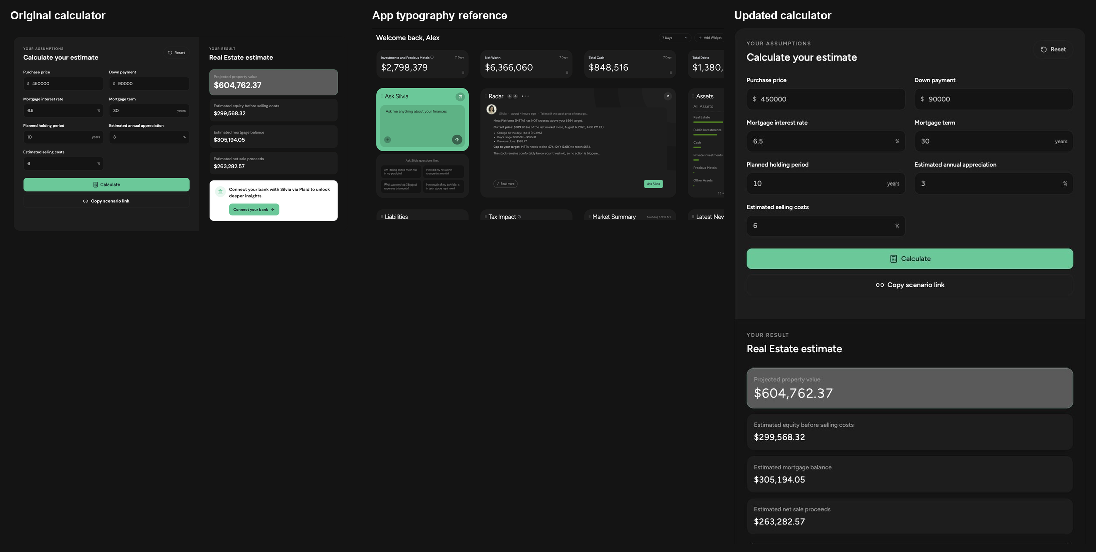
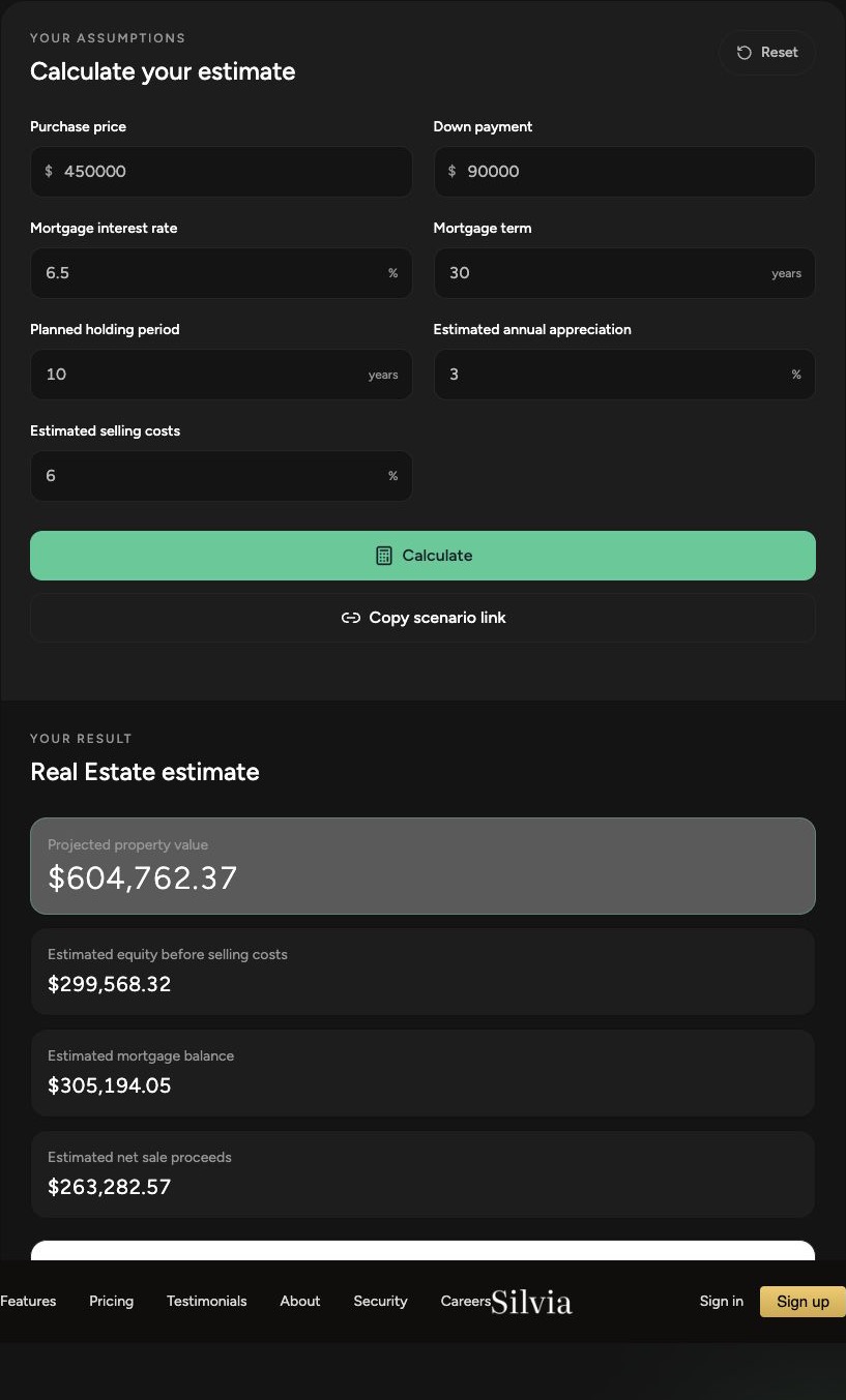

Comparison history
Iteration 1
- The calculator route loaded DM Sans while the Silvia app uses Figtree.
- Form headings, action labels, section eyebrows, and result values overused weight 600.
- The primary and supporting result values did not reproduce the lighter numeric hierarchy visible in app dashboard cards.
Post-fix verification
- Calculator sans text inherits the root Figtree font through
font-sans. - Functional headings, buttons, and labels use weight 500.
- The primary result uses weight 300 with restrained numeric tracking.
- Supporting results and chart values use weight 400.
- Computed browser styles confirmed Figtree and weights 500, 300, and 400 on the intended surfaces.
- The page loaded without a Next.js error dialog or browser console errors.
Fidelity surfaces
- Fonts: passed. Functional calculator UI now matches the app’s Figtree family and weight hierarchy. Instrument Serif remains intentionally limited to public-page editorial headings.
- Layout and spacing: passed. No structural spacing or responsive layout changes were introduced.
- Colors and theming: passed. Existing semantic tokens remain unchanged.
- Icons and assets: passed. Existing Lucide icons remain consistent; no new visual assets were required for this typography change.
- Copy: passed. Typography work did not alter calculator content.
- Interaction: passed. Inputs, reset, calculate, copy-link, and CTA affordances remain intact.
- Accessibility: passed. Heading structure, labels, focus states, and touch targets were not regressed.